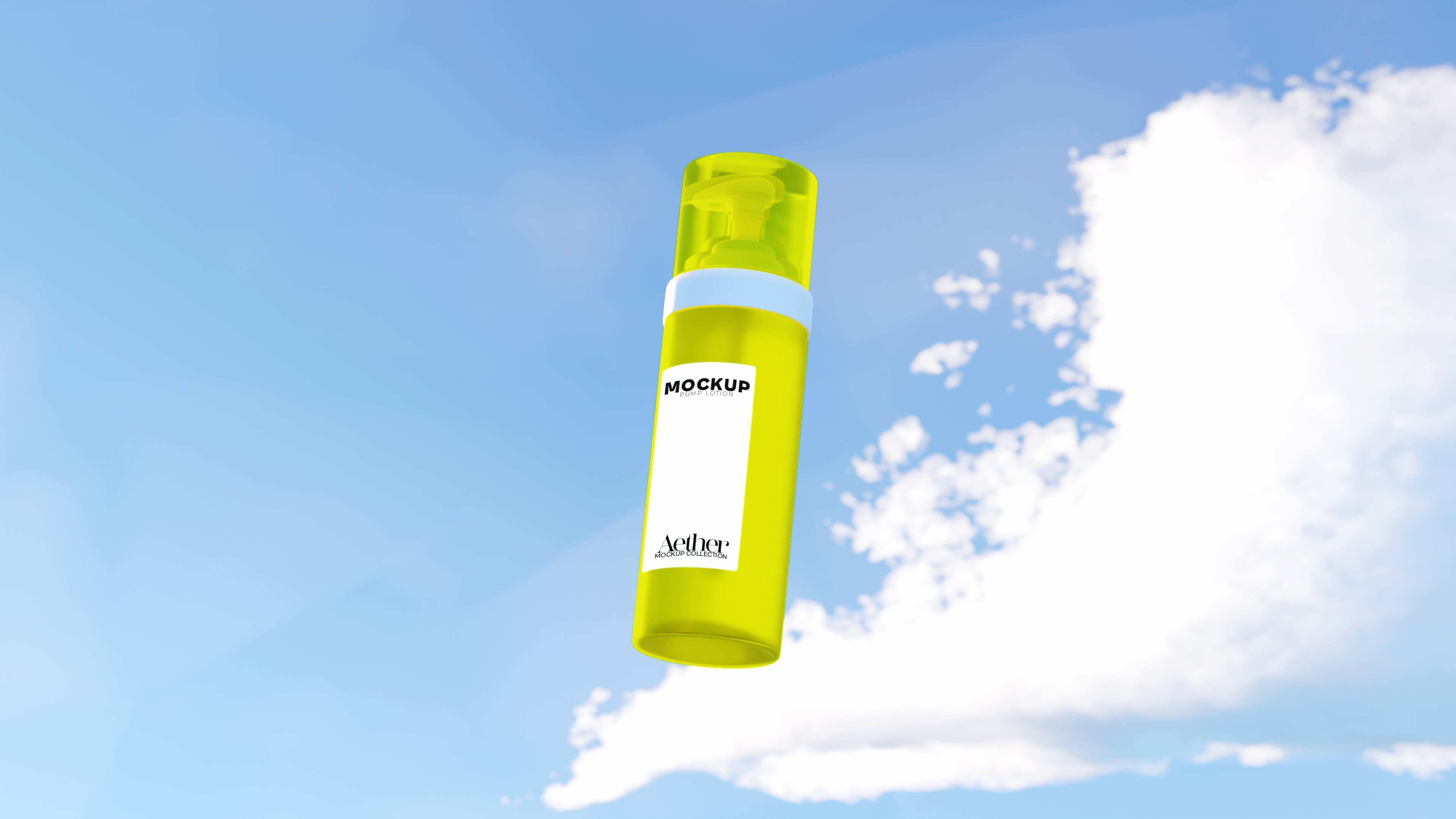
You’ve seen them: the all-white backgrounds, soft shadows, perfectly centered products floating in sterile nothingness. They’re the ""clean mockups"" that have dominated design marketplaces, Etsy shops, and brand launches for the better part of a decade.
But here’s the uncomfortable truth: they don’t always sell.
In fact, they might be killing your conversions.
At Banana Mockups, we’ve spent years watching how people use mockups—and more importantly, how customers react to them. We realized something pretty quickly: clean mockups look good on a moodboard… but they don’t do enough when it comes to actual sales.
Let’s unpack why we ditched them.
1. Clean Doesn’t Mean Clear
The “clean” aesthetic was born out of a desire for simplicity—but somewhere along the way, it became generic. A plain white mug on a white table in a white room doesn’t tell your customer anything. It doesn’t say:
Who this product is for
What mood or vibe it gives off
How it fits into someone’s life
And that lack of context can be deadly for new or niche brands trying to build trust fast.
2. Your Product Deserves Character
People don’t just buy a shirt or a tumbler or a tech sleeve. They buy identity. They buy vibe. They buy something that reflects how they see themselves—or want to be seen.
So why are we showing products in blank slates?
When we started designing mockups at Banana, we leaned into scenes with texture, attitude, context. Think messy desks, moody lighting, sun-drenched patios, nightstands with books and half-drunk coffee mugs. These are scenes where real life happens—and where products make sense.
3. Clean Mockups Hide the Product, Not Highlight It
Contrary to what the aesthetic suggests, clean mockups often flatten your design. There’s no depth, no contrast, no environment to help the product pop. And worst of all? The customer has to imagine everything themselves.
Good mockups don’t leave things to the imagination. They show the customer how the product fits into their world. They make it easy to say yes.
4. Conversion Data Doesn’t Lie
We’ve tested it. So have our users.
The same design shown in a moody, styled, well-lit mockup can outperform a “clean” version by 30–60%. Why? Because one looks like an ad. The other looks like life. One screams “template.” The other whispers “want.”
5. Clean Mockups Age Quickly
Design trends move fast. What felt minimal and modern in 2019 now feels corporate and cold. Today’s buyers crave authenticity. They want to feel something when they browse.
Mockups that feel lived-in, art-directed, and emotionally resonant not only hold attention longer—they help establish brand aesthetic, not just brand assets.
Our Approach: Scene-Driven, Not Sterilized
At Banana Mockups, we build every scene with intention. We don’t start with blank backgrounds—we start with stories.
We ask questions like:
What kind of person uses this product?
What time of day are they using it?
What other objects would be in the shot?
Does this look like a moment, not a setup?
This is why our mockups feel different. Because they are.
So, Should You Never Use Clean Mockups?
Not necessarily.
There’s still a time and place for minimalism—especially when you're showing off a logo or testing a wide variety of designs. But if every product in your shop looks like it was photoshopped onto a blank table... you might be leaving money on that table.
The Bottom Line
""Clean"" mockups may look pretty. But pretty doesn't always sell.
We stopped making them because we wanted more for your work. We wanted mockups that didn’t just show products, but sold them. And honestly? So did our users.
Try one of our collections and see the difference for yourself. Because bland doesn’t build brands—and clean doesn’t always convert.
