Safe Haven for Killer Design — Inside the Sanctum Mockup Series
Some mockups shout. Some distract. Others feel like a Pinterest board threw up.
Sanctum does none of that.
This mockup series was designed for a very specific kind of brand: the kind that wants control.
Visual calm.
Design-led environments that whisper instead of scream.
The Sanctum Collection
Why We Built It
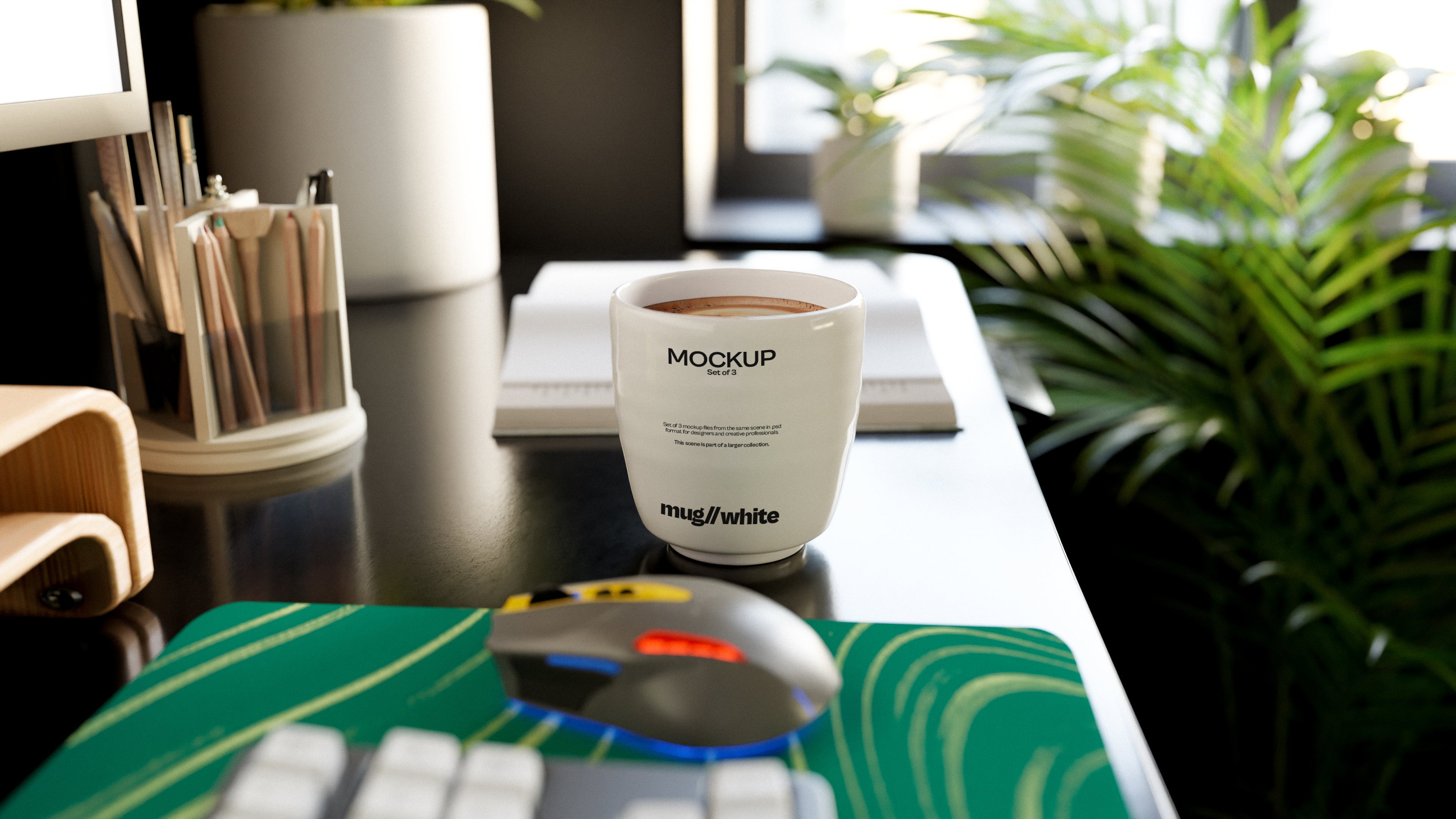
We noticed something missing in the world of mockups—spaces that respect the work. Not everyone wants overexposed daylight, vases full of baby’s breath, or random accessories that don’t match the brand. Sanctum was born from that gap.
This collection was designed to do less—but better. The architecture of the scenes is purposeful: flat walls, soft shadows, and understated palettes. Nothing competes with your product. Everything is there to support it.
What Makes Sanctum Different
Clean but not sterile – These are minimal environments, but not lifeless ones. There’s soul in the light and structure in the shadows.
Real CGI magic – Built with CGI so you get full realism without the limitations of photography. Lighting is consistent. Perspectives are precise.
Purposefully quiet – No fake props, no fluff. Just structure and surface—because sometimes that’s all a strong design needs.
Who It’s For
Brands with a strong visual identity that don’t want it compromised
Designers who love control over their presentation
People who are sick of “Instagram Clean” and want “Editorial Sharp”
The Strategy Behind the Stillness
By simplifying the environment, we shift focus back to what matters: your work.
These mockups aren’t built to wow your Instagram followers—they’re built to close the sale, win the pitch, and reinforce your brand.
Stillness is a strategy. And Sanctum makes it work.
Final Thought
There’s power in restraint. And when your product is strong, you don’t need loud sets or styled distractions to sell it. You just need a clean, confident space to let it breathe.
Sanctum is that space.
Welcome in.