Mid Century isn’t just a design trend—it’s a whole attitude. Confident. Intentional. Effortlessly stylish.
And when it comes to mockups, that’s exactly what this collection brings to the table (alongside some very handsome wood grain).
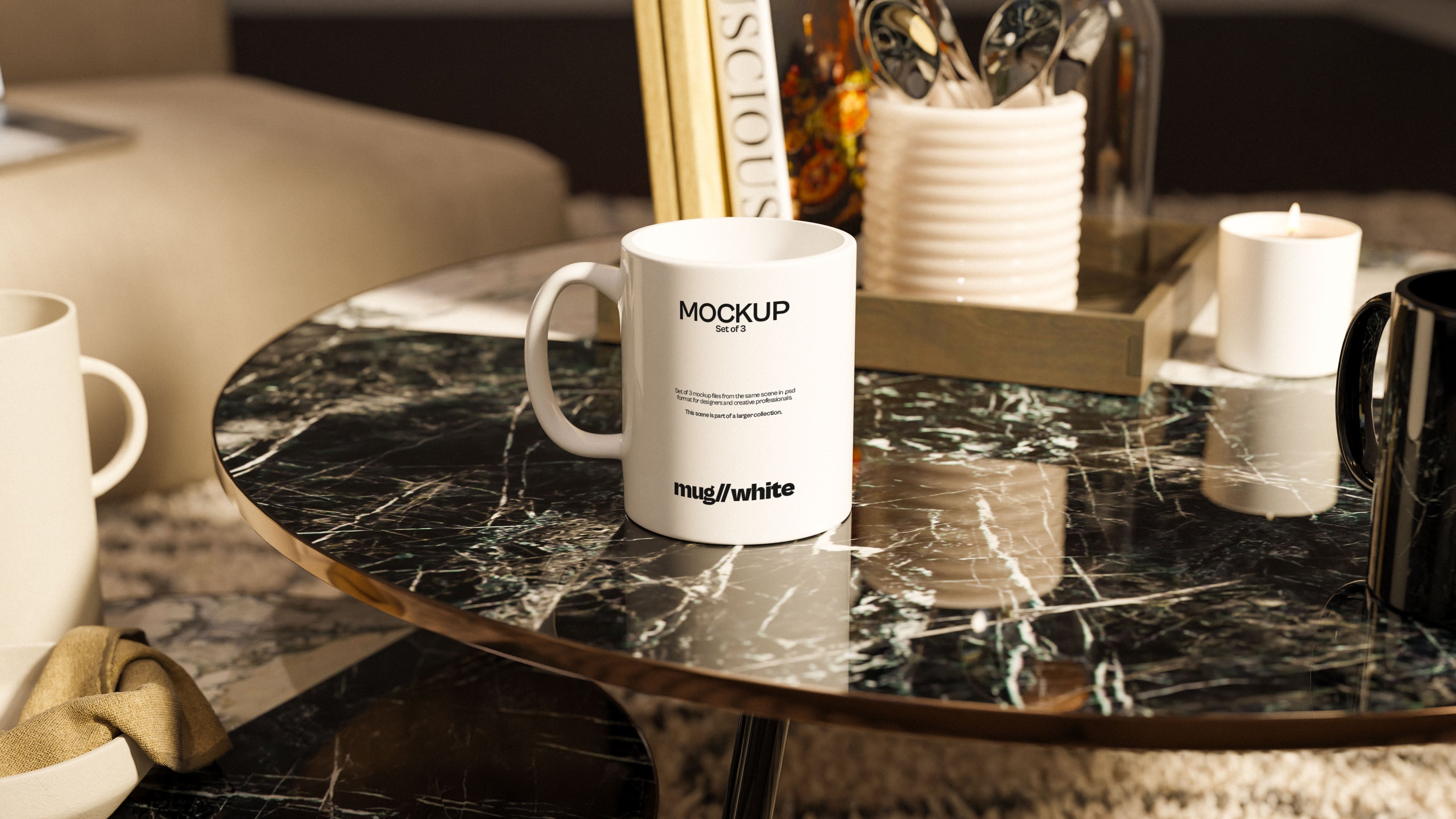
The Mid Century Mockup Collection
With its low-slung furniture, matte textures, and soft ambient lighting, this set leans into that nostalgic visual language—but doesn’t get stuck in the past. It’s retro with a modern lens. Perfect for designers who appreciate a bit of history with their Helvetica.
Form Follows Function (and Then Some)
These aren’t novelty mockups. They’re practical design tools crafted with the Mid Century aesthetic baked right in. Each scene is balanced, composed, and full of the kind of rich detail that makes your work look like it belongs in a coffee table book.
Think walnut textures, soft leather, brass finishes, and real atmosphere—no artificial glow or sterile backdrops here.
Perfect for Vintage-Inspired Brands
Got a logo with a nod to the ‘60s? Packaging that belongs next to a tube radio? A minimalist layout that still feels warm? This is where it shines. These mockups are especially ideal for stationery, brand identity suites, product labels, and design presentations that need a little mid-century muscle.
Cool, But Not Try-Hard
The best part of Mid Century design is how self-assured it feels. These mockups carry that same energy. No need for gimmicks. No need to shout. They make your work look sharp without upstaging it.
Because sometimes, the coolest thing in the room isn’t the loudest.
It’s just the one with the best taste.