There was a time when your biggest design challenge was understanding a client’s vision. Now? It’s decoding the Instagram algorithm, reverse-engineering Pinterest trends, and wondering whether a carousel post will convert better than a static visual. Somewhere along the way, creative work became a game of performance metrics—and the designer? Caught in the middle.
Let’s talk about it.
1. When the Brief Meets the Feed
Every project starts with two forces pulling in opposite directions: the human client and the machine-based algorithm. The client wants visuals that reflect their story. The algorithm wants visuals that feed the machine—quick, scroll-stopping, optimized for engagement. These two don’t always speak the same language.
Take a candle brand, for instance. The client may envision a moody, cozy setup in low light, reminiscent of a rainy cabin afternoon. But on TikTok or Instagram, dark-toned content rarely performs well. Bright, clean, high-contrast imagery gets favored by the platform. So, do you follow the art direction or the algorithm?
The best designers find a way to do both.
2. Authenticity Still Wins (But So Does Framing)
Contrary to what the metrics might make you believe, the internet hasn’t fully lost its taste for authenticity. But now, it needs to be dressed up. Raw is in—but it must still be beautifully lit. Candid sells—but the typography needs to be tight. People want truth—but they want it in a trending format.
As designers, we have to package the brand’s authenticity in a way that algorithms will deliver. You’re not compromising the brand—you’re translating it. A strong identity that adapts well to these demands is not weaker for doing so; it’s smarter.
3. SEO Is the New Typography
Words used to be the secondary part of a designer’s job. Now, they’re central. Designing for a Shopify banner? Better keep “free shipping” visible. Creating a mockup for a new planner? Make sure “undated” and “2025 printable” appear—because even your visuals need to speak Google.
This applies to mockups too. The best visual doesn’t always win. The one with the right keywords in its file name, the right alt-text, the right context—that’s the one that gets found.
So we adapt. Aesthetic without context doesn’t convert. Beautiful images without metadata are just… beautiful images. And this is where strategy enters the frame.
4. Metrics Can Be a Muse (If You Let Them)
Designers don’t like numbers. But they’re not the enemy. In fact, they might just be your most underutilized muse. When you learn which visuals make people stop, click, buy, or share, it’s not just data—it’s direction.
If 80% of your audience is saving flat lay images instead of lifestyle ones, you’ve got insight. If product mockups with white backgrounds outperform styled shots, don’t take it as a critique—take it as a clue. The algorithm isn’t just a beast to fight. It’s a behavior report.
And understanding behavior? That’s design gold.
5. Create Once, Repurpose Smart
Here’s a trick we use at Banana: We design for the client, then remix for the platform. One base asset can be turned into an Instagram visual, a website header, a Pinterest Pin, and even a product thumbnail. All with slight art direction shifts to match each platform’s native language.
This means the client gets what they need—and the algorithm gets what it wants. Everyone wins.
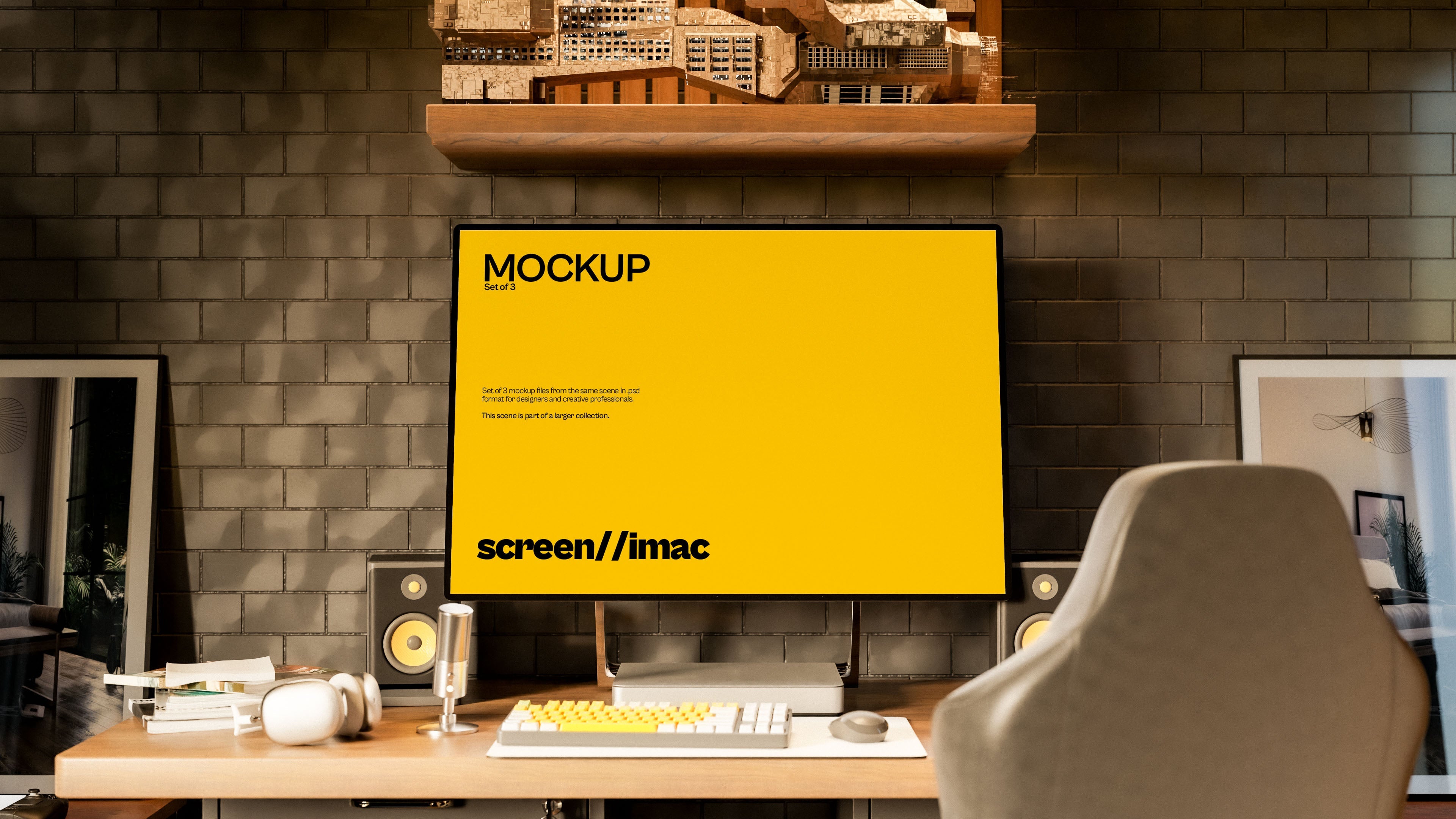
Mockups play a huge role here. That’s why we build ours to be flexible. Whether it’s a square crop for Etsy, a vertical format for Pinterest, or a cinematic wide shot for a brand deck, each scene is optimized to be as dynamic as the designers using them.
6. The Real Question: Who Are You Designing For?
In the end, it’s not just about the client or the algorithm—it’s about your own values as a designer. Do you want to create work that connects? Work that converts? Work that endures? You can (and should) aim for all three—but your approach will define how far each one goes.
At Banana, we believe good design is human-first, machine-aware. That means we never start with trends—we start with intention. Then we make sure that intention survives every crop, caption, tag, and swipe.
Because designing for algorithms alone is soulless. Designing for people alone is naive. But designing for both? That’s where the real skill lives.
Final Thought
You’re not just a pixel pusher—you’re a translator. Between human need and machine logic. Between what a brand is and how it performs. That middle ground? It’s hard. But it’s also where the best designers thrive.
And if you’re feeling stretched thin between art and analytics—trust us, you’re not alone. But the good news? You’ve got the tools to win on both fronts.
Just don’t forget who you’re really designing for.
